Don't worry, guys, there will be banners coming with ZHP cars in them. For now, I'll keep this one up.

 Founder of ZHPMafia.com
Don't worry, guys, there will be banners coming with ZHP cars in them. For now, I'll keep this one up.
 Boss
Boss
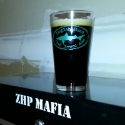
Looks great, Mark.
-Be yourself; everyone else is already taken.
ZHP Pre-Ride Briefing
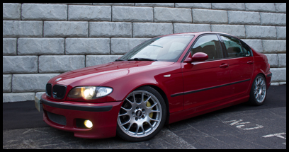
2005 ZHP, Alcantara, Silver Cube, Nav, Sharked, BMW Perf Intake, BMW Perf CF Strut Brace, CF Valve/Fuel Rail Covers,
Shadowline Grills, CF Splitters, Fog Light Inserts, Euro-mirrors, CDV Delete, Beisan vanos, GAS DISA, BP Coded
Founder of ZHPMafia.com
For the record, I do understand that not everything I do on this site will please everyone. I try my best, though.
And BP is not incorrect. The new logo is fairly boring and plain. It's just that boring and plain can work -- especially when it's simple and clean. That's why I went with this latest look.
Having said that, if BP said that he would never post on the site again if I left that banner up, I would remove it.
 Capo di tutti capi
I think you nailed the clean, simple look perfectly.
Call Me Dane l 2/2004 330i ZHP l 18x8 ET45 BBS CK's wrapped with Michelin Pilot Sport AS3+ @ 245-40-18 l KW V1 Coilovers in front l KW V1 springs w/ Bilstein B8 dampeners in rear l BMW Performance Rotors l UUC StrutBarbarian l Racing Dynamics Rear Strut Bar l Jim Conforti Shark Injector l Light Birch Interior Trim l Bimmian Celly Mount l M3 Trunk Mat l l e90 Performance E-Brake & Shift Knob l M3 Tri-Stitched Boots l AL Headlight Retrofit with ZKW Lenses l CobyWheel Wrap w/M3 Stitching l LCM sw 4.5 triple blink and rear fogs l Maple Interior Trim
Founder of ZHPMafia.com
I did a few more tweaks on it. Made it a little bigger, so the roundel is less fragmented. And I dropped the ZHPMafia.com writing down a bit.
I'm content with the final product.
Thanks for all of the input.
 Capo
Capo
Originally Posted by danewilson77
 Well, what is so unprofessional and/or unclean about the previous one? I thought it was very well done and well integrated with the colors on the site at the time. I know you changed the colors a little, but it would still match what's on the site now...
I'm never posting on this site again 'till you put up the old one.Having said that, if BP said that he would never post on the site again if I left that banner up, I would remove it.
(j/k)
Of course, this is a given. I was just wondering what was so wrong with the old one, that's all. I always thought logos/banners that were more well blended with Photoshop effects were more professional from a design standpoint, not a business standpoint. If the business-professional look is what you're going for, Marcus, then I think you did alright. I just don't see the need for a "business"-professional as opposed to a "design"-professional. Know what I mean? I don't think I'm explaining it very well. lol
I could definitely get used to the current banner and will end up not caring, just thought it was much cooler to have a member's car up there with cool blended effects. Gives the site more personality, which is important for a site as people tend to remember a site with personality more than one without any. We have quite some personality here, but that is in the form of posts, not immediate "wow, this site looks cool!". I'm sure this will change with time, but just giving my view as someone who's seen quite a few forums and have dismissed a few simply because of the presentation.
BP
2005 330i ZHP / 6MT
Imolarot / Naturbraun
2003 330iT / 6MT
Orientblau / Naturbraun
It's not the car you drive, it's how you drive it.
 Big Earner
Im sure i wil mention not seeing my car up top some other time in the future, but for the record, i do not mind the clean look of the banners. Im sure you will find the happy median, marcus!
"No, Donny, these men are nihilists, there's nothing to be afraid of"
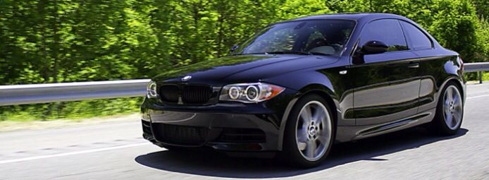
09 135i Msport 6mt
04 330i ZHP (sold)
David
Founder of ZHPMafia.com
BP, I very much appreciate the feedback. Much respect to you.
The site, in its infancy, will undergo a lot of change. Change does not reflect negatively on what came before. I've made a lot of changes to this site during the first two months. Some 99% of the changes have been so subtle that most members have not even mentioned them.
Tonight, when I get home, I will look at some of the cached pages and see if I can detect all of the changes that I've implemented.
Separately, getting to your comment about business-professional v. design-professional, I see what you mean. At this point, I think the simple design kind of conveys what we are. You get less flash here and more substance. The logo is a reflection of that. That's my thinking. Indeed, how many times have you seen a shiny, pretty object that made you think it was better than it was. The wrapper bedazzled but the product failed to deliver. Here, we deliver without the need for a pretty and slick package.
Now look what you have me doing. I'm beginning to wax philosophical. Hehe.
Anyhow, this banner will not be the be all, end all in banners. There will be more iterations in the future.
Thanks for indulging me, guys.
 Enforcer
Do you want a copy of the logo minus the white ring around the outer edge + beveled to look 3d? Such as in my signature and avatar. This wouldn't work so well with a black background, unless you somehow define the edges. I miss the old one, but I made it so of course I liked it. I still made part of this oneI'm glad everyone likes the roundel. You could have nothing up there and I'd still love the site, though.
Enforcer
No white ring, black border, slight white glow to separate roundel from background (no beveling & with beveling):

Last edited by Tampa330i; 01-19-2011 at 06:06 AM.
 Posting Permissions

 Reply With Quote