I now have stencil on the site. I think we all liked that one previously.
Thoughts?


 Founder of ZHPMafia.com
I now have stencil on the site. I think we all liked that one previously.
Thoughts?
 Capo di tutti capi
It looks ok...by itself......but with the clean font in the roundel...I think it looks outta place.....imvho.
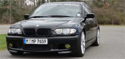
Call Me Dane l 2/2004 330i ZHP l 18x8 ET45 BBS CK's wrapped with Michelin Pilot Sport AS3+ @ 245-40-18 l KW V1 Coilovers in front l KW V1 springs w/ Bilstein B8 dampeners in rear l BMW Performance Rotors l UUC StrutBarbarian l Racing Dynamics Rear Strut Bar l Jim Conforti Shark Injector l Light Birch Interior Trim l Bimmian Celly Mount l M3 Trunk Mat l l e90 Performance E-Brake & Shift Knob l M3 Tri-Stitched Boots l AL Headlight Retrofit with ZKW Lenses l CobyWheel Wrap w/M3 Stitching l LCM sw 4.5 triple blink and rear fogs l Maple Interior Trim
 Messaggero
VERY good - Impactful, "robust" look - just like business cards! Me likey.
I hope others will chime in...curious to see what they think...
2005 AW ZHP Coupe. CW, Alcantara, Leather st. wheel, HK, Xenons, Step, Dinan chip & air box, USASpec, Sprint Booster

Founder of ZHPMafia.com
I think Dane is onto something, though. The stencil does not match the ZHP MAFIA writing on the roundel. Seems mismatched. I think, Wash, that you have us thinking properly about the fonts -- so that they will match the rest of the site. But stencil is difficult because it's the only thing that has that look. Doesn't look as cohesive.
Thoughts?
Founder of ZHPMafia.com
I'm going to try and match it with the rest of the site. We'll see how it looks.
 Messaggero
Is it weird that I like the serifs in the site name in the banner only and nowhere else? It sets it off.
Founder of ZHPMafia.com
Do you like the current one, Lance?
Messaggero
Yes sir
Founder of ZHPMafia.com
Good. I'm a perfectionist, so I am not sure that I will ever settle in on a single look. I'm content for now, though.
Founder of ZHPMafia.com
How about the current font?
 Posting Permissions

 Reply With Quote