
Originally Posted by
UdubBadger

***these opinions are totally subjective - please don't get offended***
youre getting the contrast idea which separates your work from true noobs which is good but here are a few comments
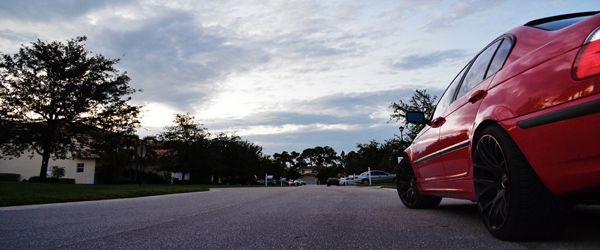
image 1 - youre creating DOF by using blur but its almost a little too obvious that its unnatural. I try to keep to subtle in this respect, add a little if needed but it shouldn't be as dramatic unless its SUPER artistic. Also its not blended as well as it would need to be, use a soft brush instead of trying to make it look cut out - if you want it cut out look, you need to be more precise with the brush cuz the edges don't look good. Its over saturated IMO which is a common thing with guys just starting out in PS, I did it too. For color correction I prefer some vibrance adjustments over saturation because its more realistic. Photo wise its not horrible but I would work more on your framing/timing. Would love to see more dog, less guy in chair. as mark and casey would likely agree with me saying - fundamentals in taking the shot far exceed the post processing done.
image 2 -better image on the framing, its a nice portrait. would have probably shot this one landscape but thats me. the subject is right dead center and kinda smaller in frame, if the shot is about the dog, pull in, if its about the dog and its surroundings, pull out. youre right in the middle which just looks general and not having a purpose or story to tell me. again, the blur doesnt work for me, learn how to get big DOF in camera instead of in post. The single color/b&w trick is well known in art school as "the wedding photographer" trick and not to put you down personally but its laughed at because its a gimmick. brides might want it but most photographers wont do it unless asked and paid well. nothing wrong with a b&w photo here, when you shoot for b&w make sure you bump your contrast for a traditional film look, you want those black a little softer though, in film most often there is no solid black but only something really close to it and lots of bright white so adjust accordingly.
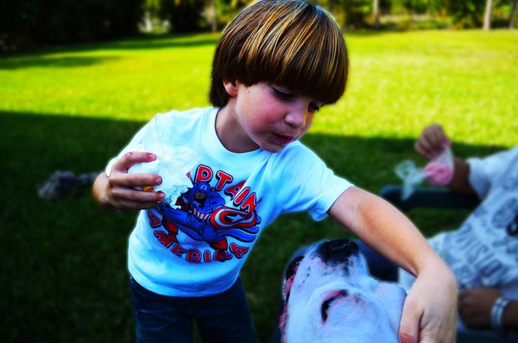
image 3 - most natural of the 3. love the jumping, not the saturation though. i would love to see this one washed out TBH. framing isn't bad, the angle hurts the action though, get low (on your knees) when you shoot kids to bring the viewer down to their perspective level. plus youd see more "air" under his feet. also the fence is either dropping about a foot every 10 ft across or you need to straighten up the photo.
hope that helps.


![http://s900.photobucket.com/user/othibau/media/Junesig.jpg.html][IMG]http://i900.photobucket.com/albums/ac208/othibau/Junesig.jpg](image.php?s=763c502f1fc6300285b5d1afc6282eb2&u=605&type=sigpic&dateline=1367713585)

 Reply With Quote


 )
) 
